Kind Companion
Kind Companion is an Android app created to help people deal with anxiety. I developed it alone in ~250 hours spread over three months as part of my internship at my university1. I also used this project to learn how to make Android apps in Android Studio using JAVA and XML.
Some functionalities implemented in the app are:
- Room Database with LiveData and ViewModel
- Audio Recorder, Camera and Image Chooser
- Custom Alert Dialogues
- Orientation-specific Layouts
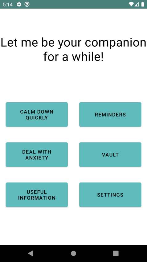
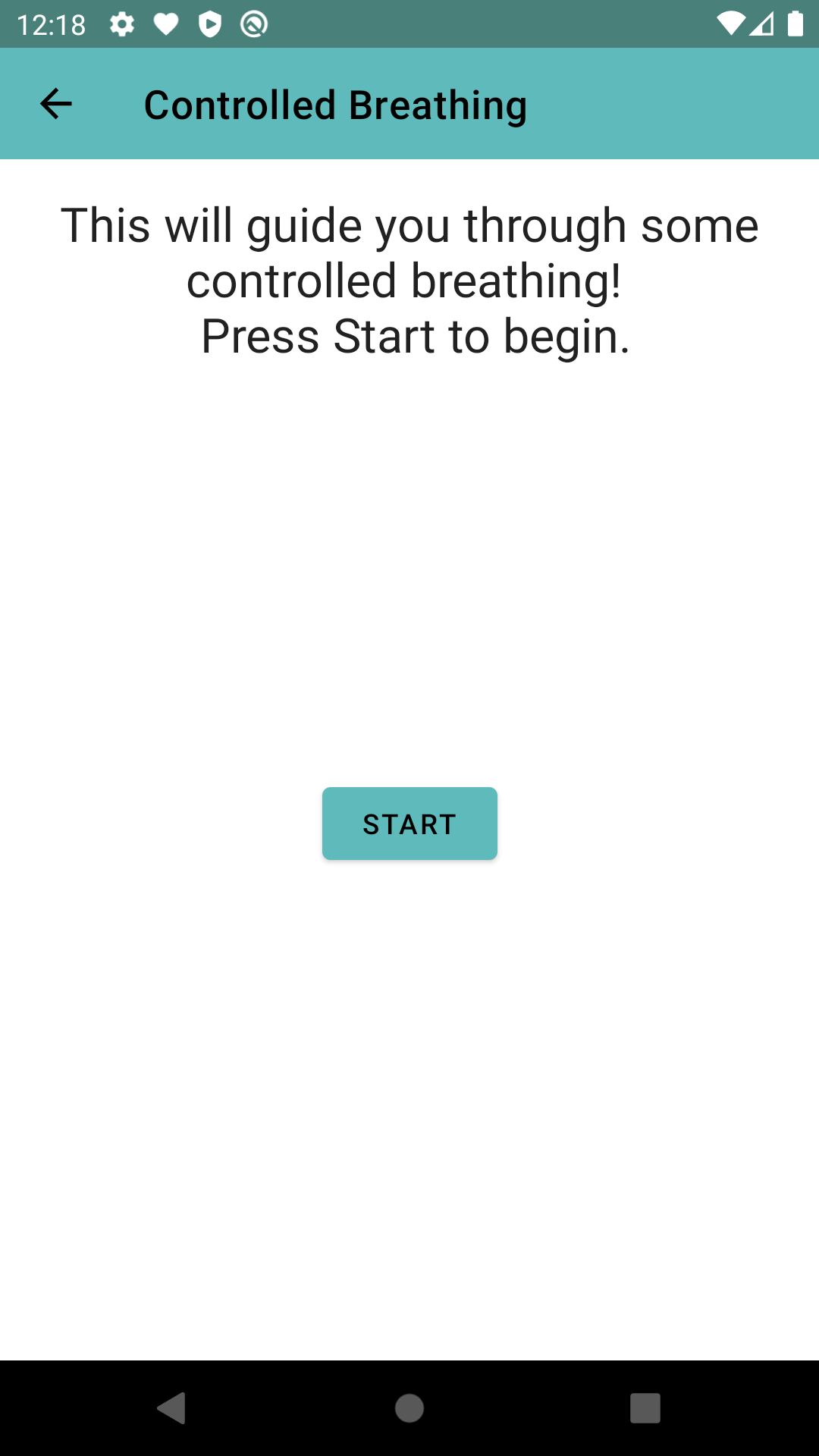
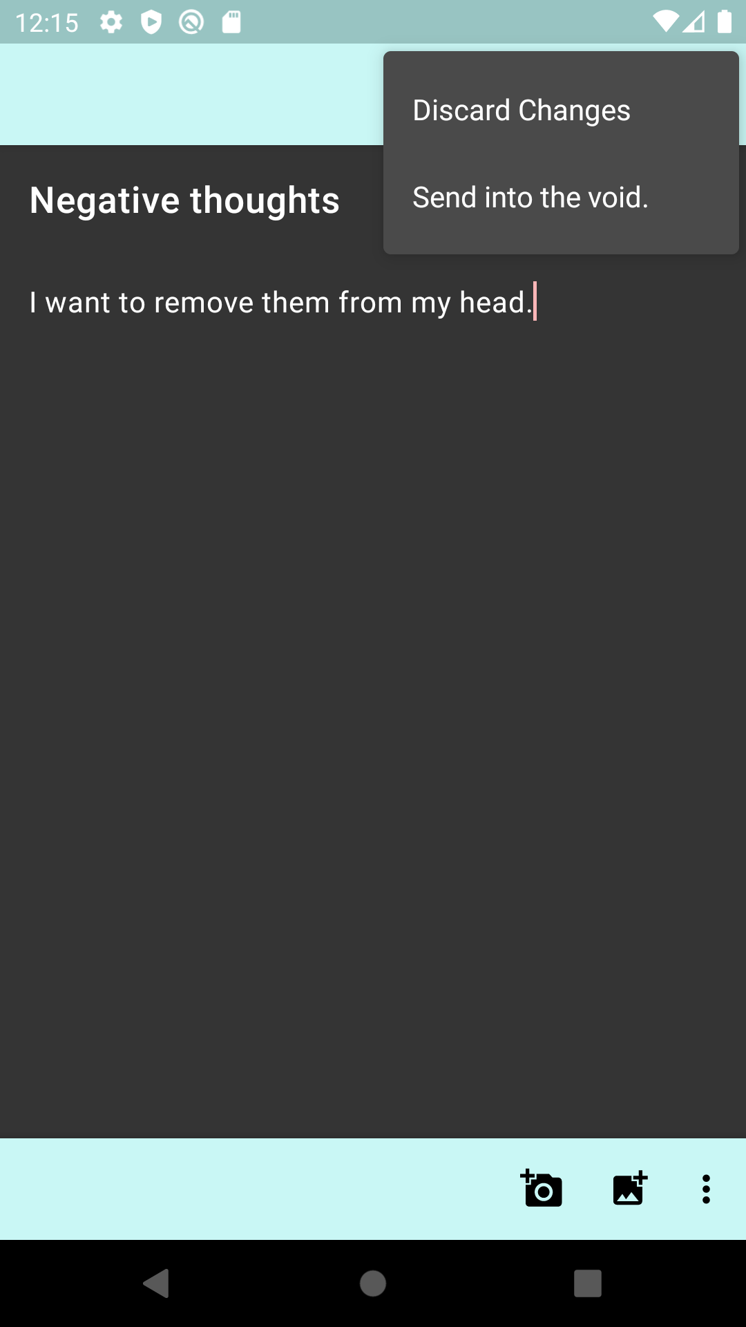
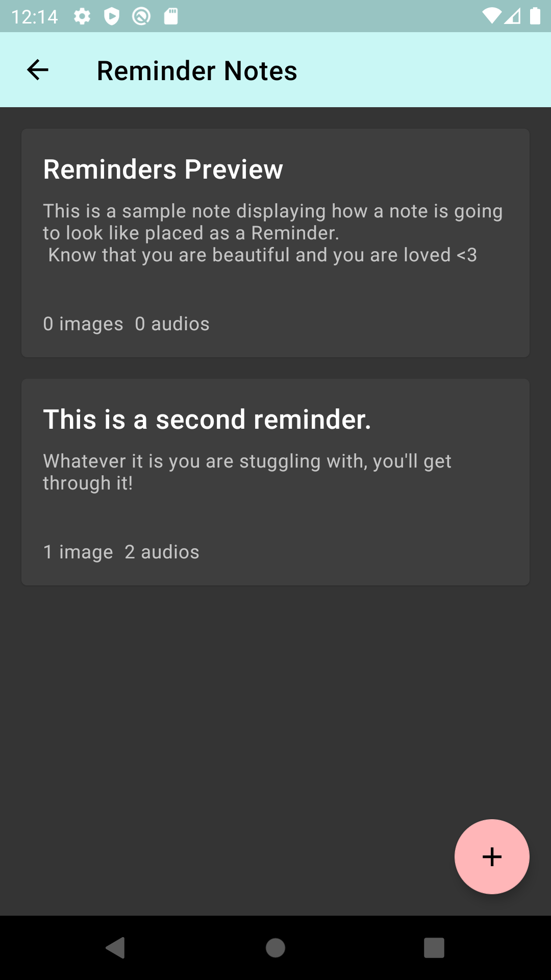
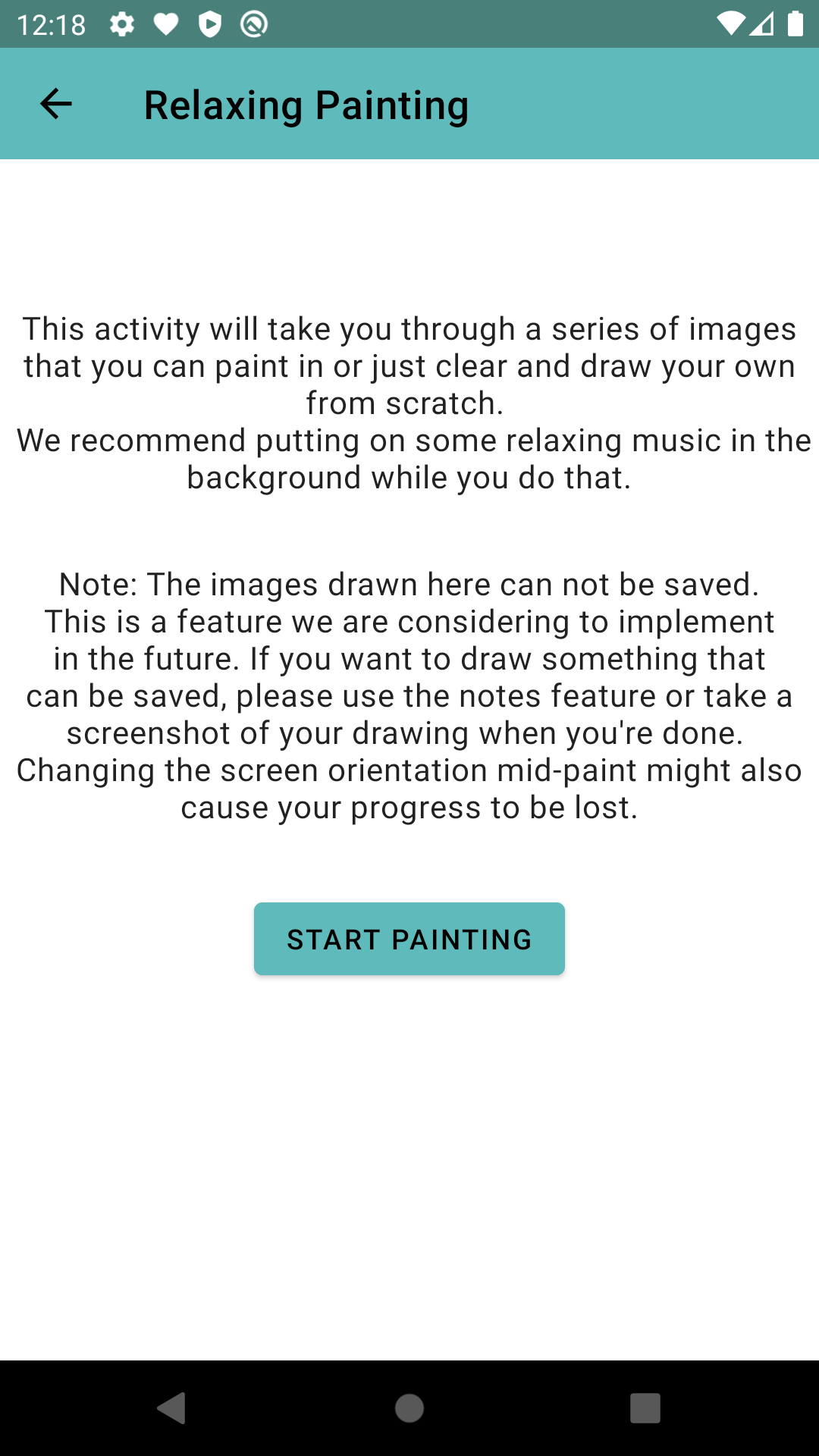
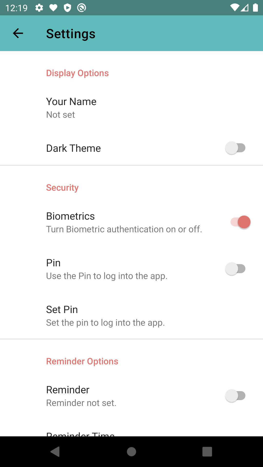
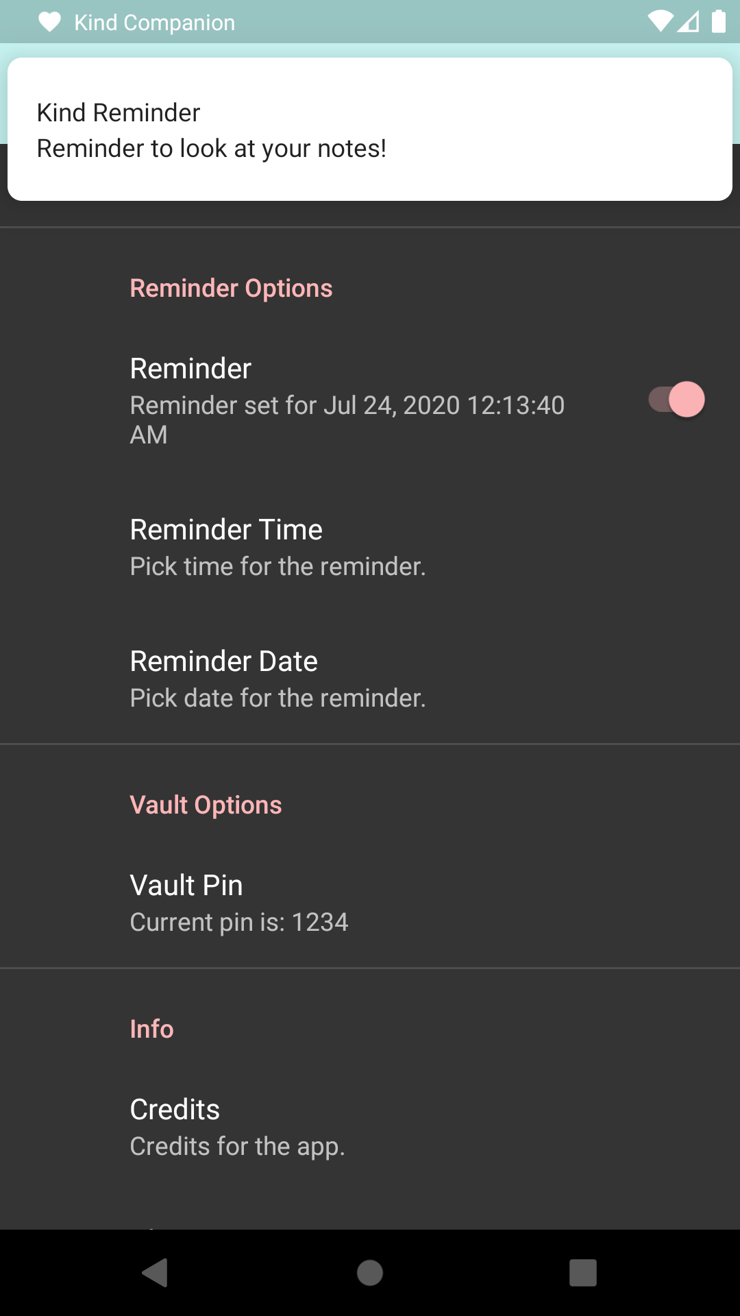
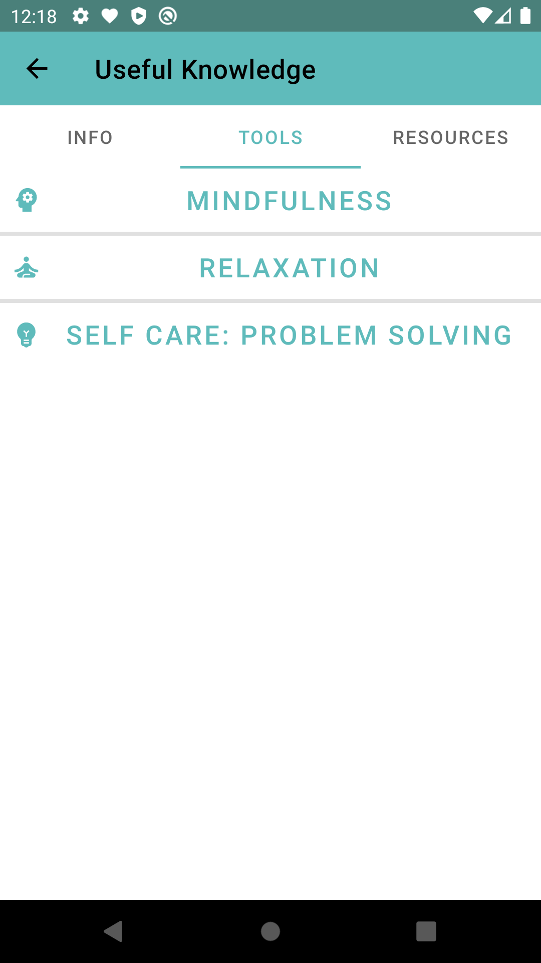
Here are some screenshots:
Following are some of my thoughts on the overall experience of developing the app. If you prefer to not read the rest of the post, you can go back to the portfolio home by clicking here.
Background
A couple of courses during my Master’s degree2 focused on non-entertainment games and eventually motivated me to explore video games for mental health as a topic. At the time of the development of this app, the COVID-19 pandemic was in full swing as well, and everyone’s mental health, mine included, seemed to be going down the gutter. After experimenting with a few mental health apps3 4 myself, I was motivated to develop such an app of my own.
Additionally, a course on the psychological impact of video games introduced me to many games associated with mental health. I was introduced to the game “Kind Words”5. I liked the idea of writing and sending thoughts away. It made it into the app as a subfeature of the notes vault.
Eventually, I decided on the professor for this course, Wolfgang Hoi6, as my primary supervisor and guide for the internship. It was a great decision as his knowledge of psychology and video games made him a great mentor and helped me with the specifics of many design features when I felt stuck.
App Design
The initial concept was to make a video game focusing on mental health. However, all the ideas I came up with needed to be more significant for an internship project. After a discussion with Wolfgang, I combined the ideas into an app.
I wanted to focus the app on helping people combat everyday anxiety. Referencing Kind Words, the basic concept I had in mind was to have a way for people to store or throw away their thoughts. Thus, I finalised the idea of a note-taking app with some added features that people with anxiety could use.
Notes
An essential feature of the app was note taking with the option to store notes as either reminders or in a secure (password-locked) vault. I used a Room database to ensure that the notes persisted in the app’s private storage and were not shared with other apps.
The UI was heavily inspired by the Google Keep app7. As a long-time user of it, I have found its notes page to be highly responsive with a great user experience, and I wanted to emulate the same in my app.
Images
One of two two sub-features of the notes functionality was the images. The user could:
- choose an image from their gallery to add to the note
- open the camera and take a picture
- draw an image
Audio
The second sub-feature of the notes functionality was the ability to record audio. The user would be able to listen to the audio after recording and then choose if they wanted to save it.
Settings
This screen changed considerably throughout development, but by the end, the settings had the following main categories:
- Display Options: Setting the user’s name and changing between light and dark theme
- Calm Down: Setting the user’s preferred method to calm down quickly
- Security: Using biometrics or a pin to log into the app and setting the pin (if chosen)
- Reminder Options: Setting the date and time for the reminder and turning it on or off
- Vault Options: Setting the login pin for the vault
- Info: Viewing the first-time use tutorial for the app again, and viewing the credits and miscellaneous information about the app
“Deal With Anxiety”
On this page, the user could choose a few methods to deal with anxiety:
- The “Five Things” game 8
- “Cross it off”
- Controlled breathing
- Painting
Wolfgang was particularly helpful in deciding what methods to put in and polishing how I presented said methods.
“Useful Knowledge”
This feature provided users with tabs for information, tools and external resources to expand their knowledge. An overview of the tabs is as follows:
- Information: about anxiety and depression
- Tools: mindfulness, relaxation and problem-solving
- Resources: websites and Android apps which acted as a supplement to the app
This was the most straightforward feature to implement, containing simple pages with text on them. The hard part was ensuring I had accurate information to display and good/valid resources to link to. Wolfgang was again a huge help here, and I felt safe knowing I had an expert like him to consult on this matter.
Material Design
To improve the UX, I read through the Material Design guidelines (ref) for app design and implemented them throughout my project. This involved:
- changing the colour scheme,
- changing the text font and style,
- making layouts screen size independent,
- adding dialogues and animations,
- changing toolbar styles, and
- replacing regular components with Material Design components.
I also implemented a dark theme for the app and a separate landscape orientation layout for the screens that required one.
Stuff that didn’t make it to the app
Motivated by the example of Kind Words, I wanted networking capabilities, cosy animations, and graphics. However, I was biting off more than I could chew at the time and did not end up implementing these into my app.
What did I learn?
Developing an Android app from scratch without knowing anything about the framework was hard. But honestly, it was easier than I thought. The Android documentation is fantastic; almost everything I wanted to do could be found as a guide in the docs. Almost everything. The painting functionality was the most challenging part by far. I had yet to gain experience with JAVA then. I had to look up many guides and StackOverflow questions to get a proper painting sub-functionality with the Canvas component. I also spent a lot of time getting the undo and redo functions to work correctly.
Another good lesson was to never skimp on properly implementing essential functionalities. Working with basic tables for the notes is suitable for prototyping, but eventually, I had to go back and make Room databases of everything. And if I had just done that from the beginning, I’d have saved myself a lot of refactoring mid-way.
The final central learning point was that similar to games, getting an app to the point of release is hard. I accounted for functionalities like polishing the UI, making a proper settings menu, user-friendliness and getting feedback from some friends. But this stuff took up more time than expected, and releasing a beta on the Play Store involved steps such as writing a privacy policy, which I was unprepared for.
Final Thoughts
Developing an app over a few months was a new and overall good experience. I’m glad I did so to prove I could make something like this and gain experience with a new framework. I am satisfied with the result, and the app got positive feedback during alpha and beta testing.
Thanks for reading!
Back to Other Work
